Futures
Rebrand for Futures: Advice, Skills + Employment


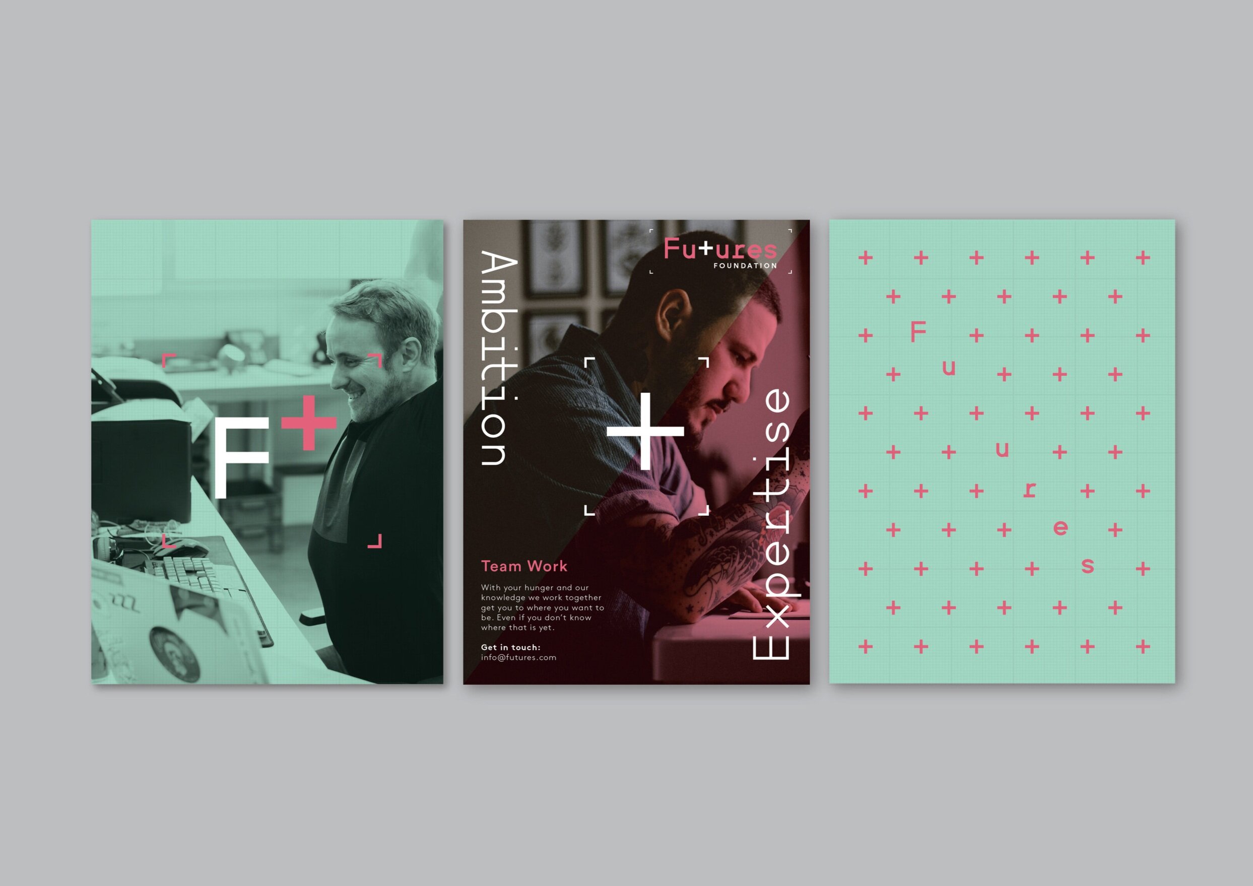
We were asked to rebrand Futures to give them a youthful, dynamic and approachable brand which would stand out from the other mundane competitors in the sector. The brand needed a solution which was transferable across all their areas of expertise. So we used a fresh colour palette which changed across each sector but till worked in
harmony holistically.
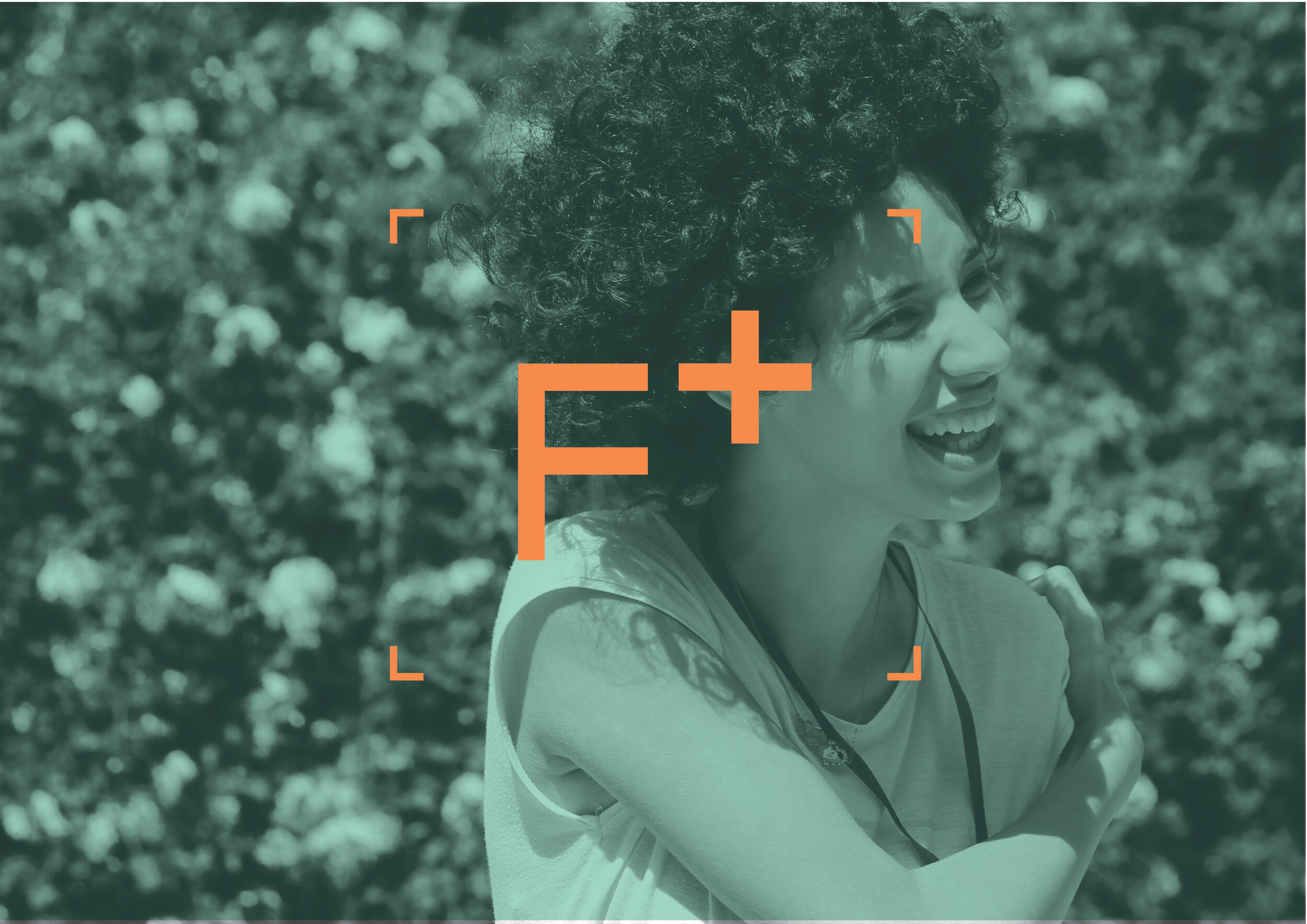
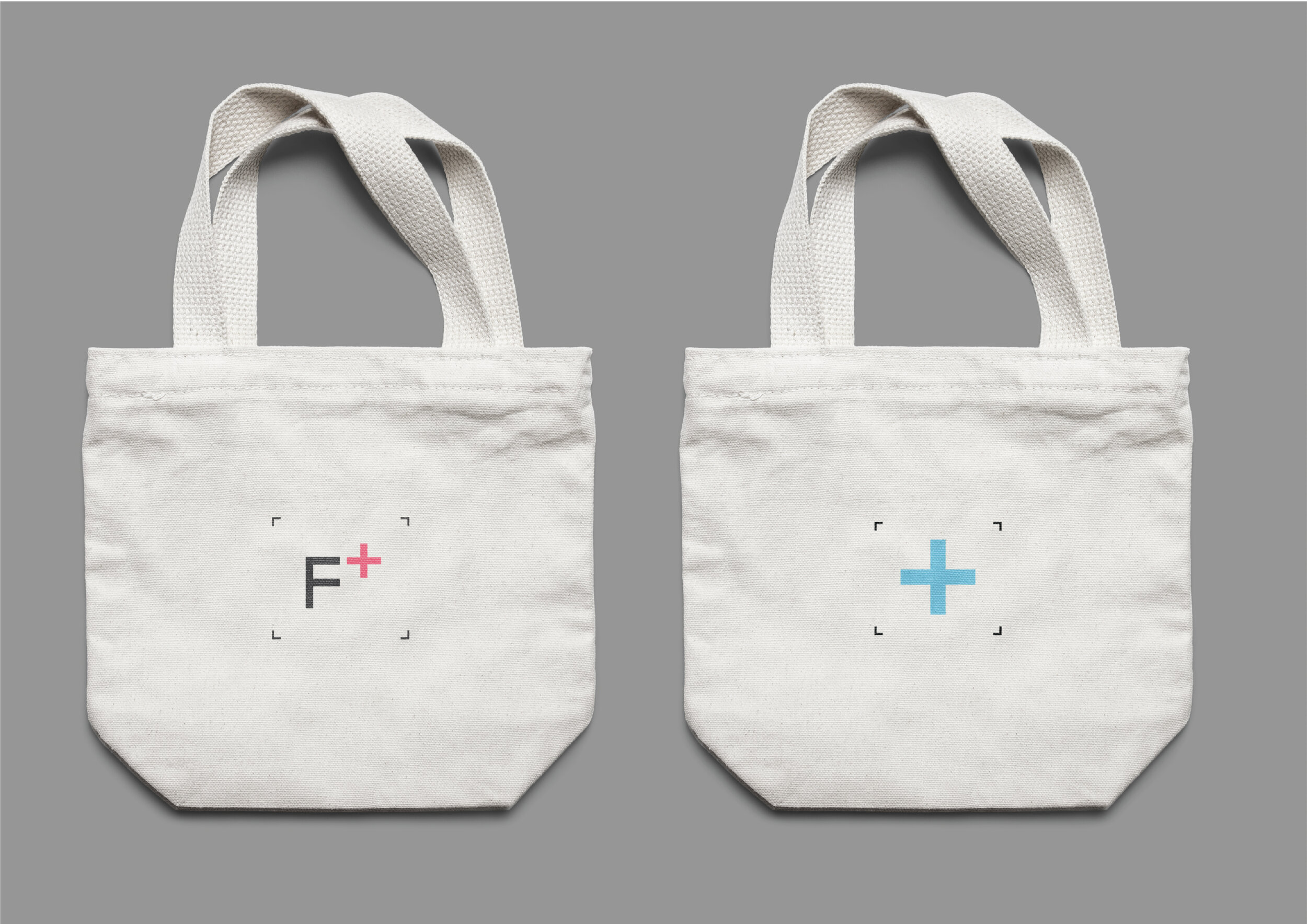
A typographic and language led identify with a playful use of the ‘+’ icon within both the logo and language.
The ‘+’ icon was used to represent the team work / partnership between the client and 'Futures' as well as being a symbol of positivity. The brand needed a solution which was transferable across all their areas of expertise. So we used a fresh colour palette which changed across each sector but still worked in harmony holistically.
Contributors
Emma Noble
Elephants Can’t Jump